호텔 아트워크
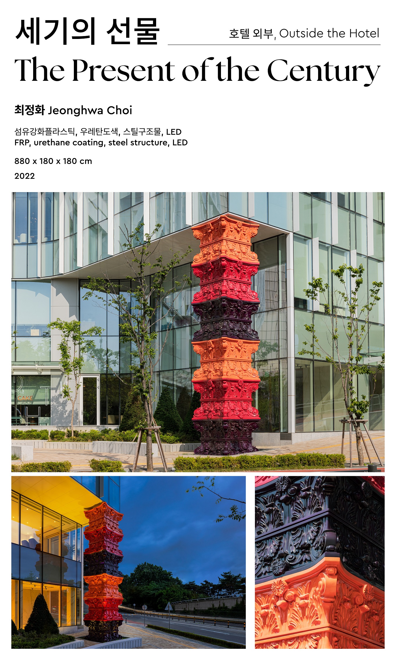
<세기의 선물>은 단순한 거대 조각 덩어리가 아닌 순간을 영원히 기억하고 공감하고자 하는 사람들의 마음에 의해 예술로 완성된다. 예술은 멀고 높은 곳에 있는 것이 아니라 가깝고 낮은 곳에 있다. 호텔 나루를 위해 제작된 이 작품은 작가 고유의 모듈 쌓기 방식과 다채로운 색상을 사용해 고전주의와 바로크 양식 기둥의 화려한 형태를 재해석하였다. 바라보는 이에게 예술을 보는 감상의 즐거움과 더불어, 전통과 역사 속 탑의 기원적 의미를 내포하며 희망과 사랑의 메시지를 전한다. 관람객은 작품을 배경으로 기념 촬영을 하고, 그 기록을 공유하거나 참여하는 활동 등을 통해 손쉽게 예술가가 될 수 있다. 그 순간 작품은 일상에 활력을 주는 기념비가 된다.
The Present of the Century reinterprets the colorful forms of Classical and Baroque columns using the artist’s own module-stacking method and vibrant colors. In addition to the joy of viewing art, the work conveys long-established meanings of tower in different traditions and history and sends a message of love and hope to the viewers. The viewer can easily become an artist by taking commemorative photos, participating or sharing the outcomes. At the moment, the work becomes a monument and creates a vibrance to daily life. Art is not by far and high, but at close and low. Not just as a mass of giant sculpture, the work is completed as an art by visitors with a desire to remember and relate to the moment forever.
Photographer @Yongjoon Choi
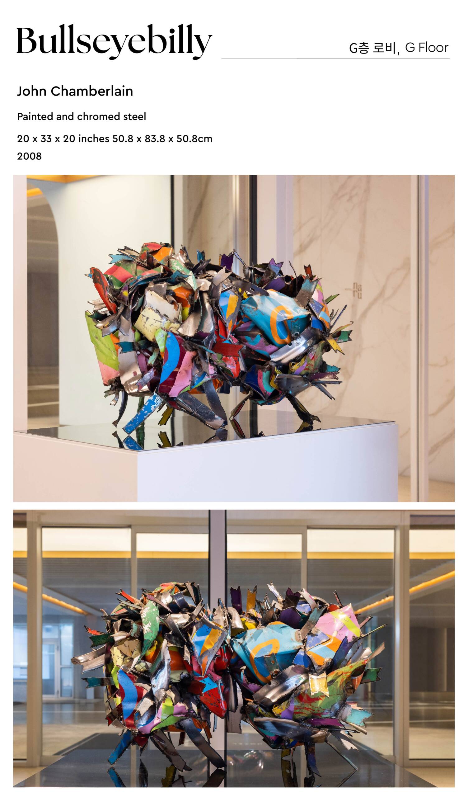
미국의 폐품 조각가인 존 챔벌린은 불안정하면서 순간적인 정연함을 통해 에너지를 분출시키는 작업을 했다. 챔벌린은 금속 자동차 부품으로 역동적이면서 달콤한 색을 가진 형태이자, 추상 표현주의의 활력과 팝 아트의 언어를 결합한 작품을 만들었다. 그는 1940년대 중반 미 해군의 일원으로 항공모함에서 보낸 시간에서 영향을 받았다고 하며, 금속을 압축하여 복잡한 접힘과 질감을 생성한 다음 서로 다른 요소를 함께 용접함으로써 전체 비율에 관계없이 볼륨과 질량을 강조하는 3차원 콜라주 기법을 발전시켰다. 그의 작품에서 나타나는 형식적 이질성과 작업 과정의 직접성에서 챔벌린이 가진 재료 고유의 속성에 대한 깊은 관심을 볼 수 있다.
John Chamberlain’s (1927–2011) distinctive metal sculptures, often made of crushed automobile steel, reveal both the stately grace and the expressive plasticity of industrial materials. Exploring the interplay of color, weight, and balance, Chamberlain tapped into the energy of Abstract Expressionism, the premanufactured elements of Pop Art and Minimalism, and the provocative folds of the High Baroque.
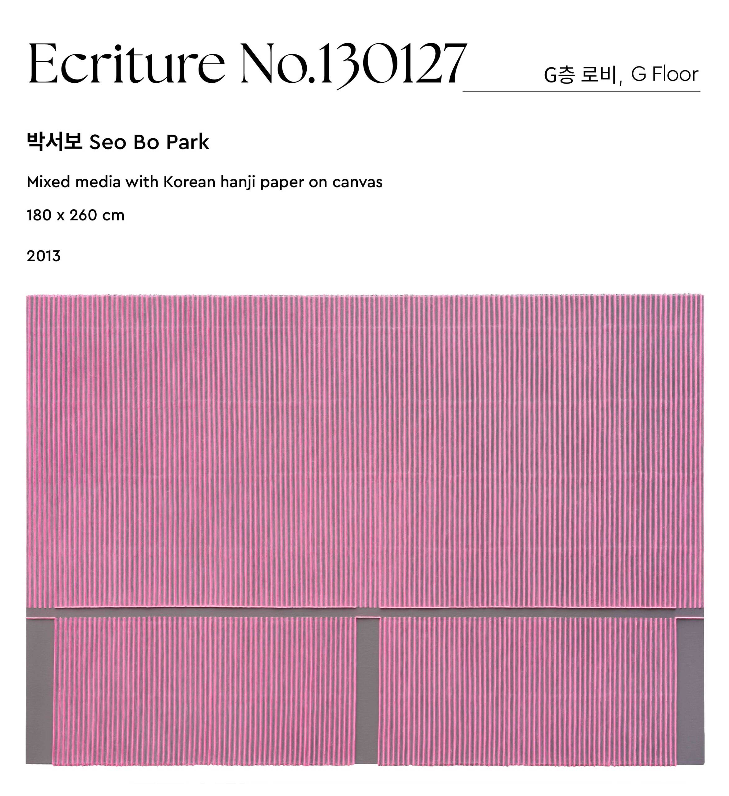
묘법 연작은 흔히 1970년대 초기(연필) 묘법, 1980년대 중기 묘법, 2000년대 이후의 후기(색채) 묘법으로 구분된다. 연필묘법이 반복되는 행위를 통해 자신을 비우고 수신하는 과정에 중점을 두었다면, 색채묘법은 손의 흔적을 강조하는 대신 일정한 간격의 고랑으로 형태를 만들고 풍성한 색감을 강조하여 자연과의 합일을 추구하는 작가의 대표 연작으로 자리매김했다. 작품 제작을 위해 작가는 두 달 이상 물에 충분히 불린 한지 세 겹을 캔버스 위에 붙이고, 표면이 마르기 전에 흑연 심으로 이뤄진 굵은 연필로 선을 그어 나간다. 연필로 긋는 행위로 인해 젖은 한지에는 농부가 논두렁을 갈 때와 마찬가지로 좌우로 밀려 산과 골의 형태가 만들어진다. 물기를 말린 후 스스로 경험한 자연 경관을 담아 내기 위해 표면에 아크릴 물감을 덧입힌다. 이렇게 연필로 그어내는 행위를 반복해 완성된 작품에는 축적된 시간이 덧입혀지고, 작가의 철학과 사유가 직조한 리듬이 생성된다.
Park’s Écriture (描法, myobop) series is often divided into three phases: the early-Écriture (or pencil-Écriture) of the 1970s, mid-Écriture of the 1980s, and late-Écriture (or color-Écriture) beginning in the 2000s. If the artist focused on emptying and disciplining himself through repetitive action through his early-Écriture series, his late-Écriture series seeks unity with nature by creating compositions defined by symmetrical reliefs modeled directly on the canvas, instead of emphasizing the traces of his hand. These elements consist of three layers of traditional Korean paper hanji, which has been soaked in water for more than two months. Built up on the canvas in concise but organic furrows, Park then draws lines with a thick graphite pencil before the surface dries. As a result of these line-drawings, the wet hanji is pushed from side to side to form symmetrical sculptural elements, reminiscent of the ridges between rice paddies. When the hanji dries, the artist adds acrylic paint to the surface to embody the natural scenery that inspires him. Through this repetitive action, the completed works manifest accumulated time, creating a rhythm where Park’s philosophy and vision are interwoven.
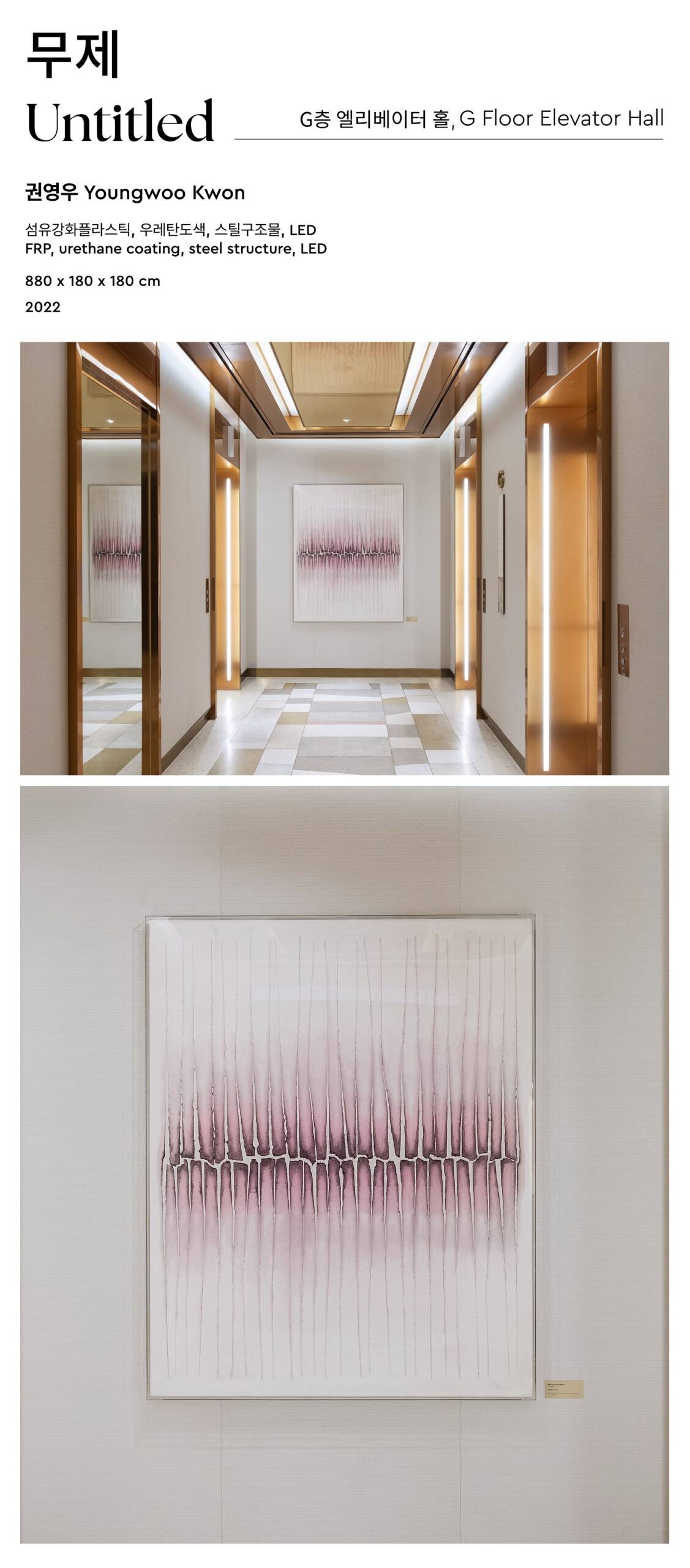
권영우는 종이 위에 그림을 그리는 화가의 기본 행위를 배제하고, 대신에 주로 손톱을 이용하여 종이를 자르고, 찢고, 뚫고, 불이는 행위 등을 통해 작가의 반복적인 행위와 종이의 물질성과 촉각성을 작업의 중심에 놓는다. 초기에는 한국화의 기본 재료인 수묵으로 구상적 추상의 표현 가능성을 탐구하는 작업을 하다가 1962년을 전후하여 필묵을 버리고 한지(漢紙)를 작품제작의 매체로 사용하기 시작했다. 그는 여러 겹으로 겹쳐진 종이의 섬세한 재질감을 강조하면서 종이 위에 만들어진 입체감과 리듬으로 조형성을 구성하였는데, 이는 동양화의 매체를 재조명하여 동양화의 영역을 초월한 새로운 문법을 만든 것이라 평가된다.
By renouncing the brush and the traditional emphasis on painting a picture, and opting to use his fingers to cut, tear, puncture and glue the paper together, Kwon Young-Woo put repetitive action and the paper’s materiality and tactility at the forefront of his practice. Early in his career, Kwon explored figurative abstraction using Chinese ink, a common Korean painting material. In 1962 he decided to use hanji (Korean paper) as the primary medium for his artistic production. His focus on the delicate hanji’s layered texture had expanded to three-dimensional shapes and rhythmic compositions that cover the entire surface. He rediscovered Korean painting materials through his innovative techniques, and created a new vocabulary to expand and transgress the definition of traditional Korean painting.
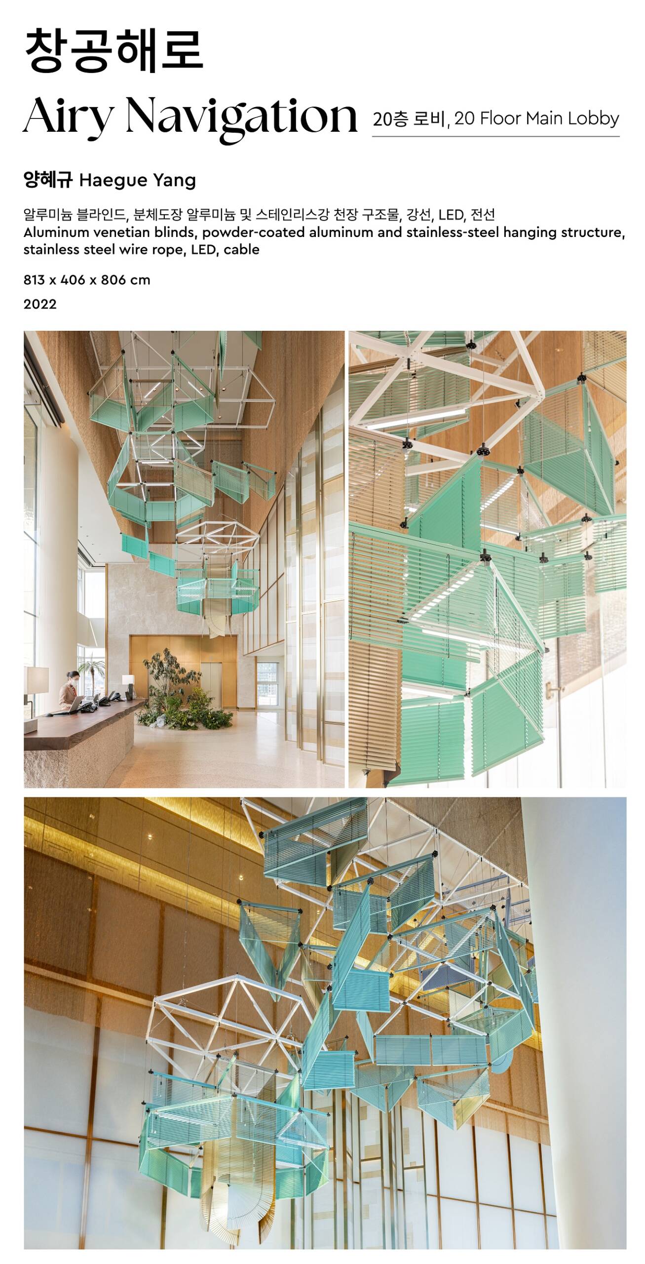
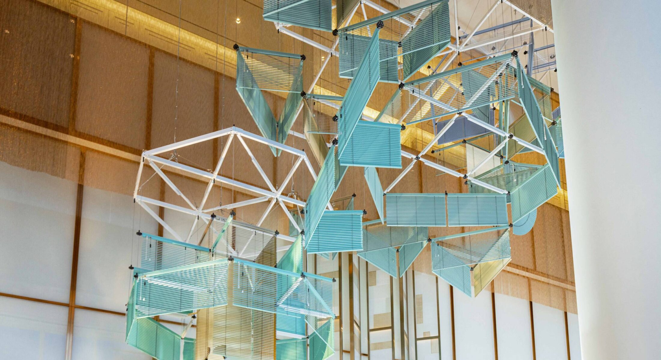
<창공해로蒼空海路>는 호텔 나루를 위해 기획된 대형 블라인드 설치작품이다. 높이에 따라 형태가 점진적으로 전개되는 구조는 관객의 시선을 호텔 로비의 통 유리창 밖으로 보이는 ‘마포나루’의 옛 물길로 자연스럽게 이끈다. 상업·무역·교통의 요충지 마포나루를 오고 가던 도하선은 사라졌지만 ‘나루’라는 단어와 마치 돛을 펼치고 물길을 거슬러 항해하는 배처럼 각기 다른 높이로 연결된 블라인드가 마포의 지난 풍경을 떠오르게 한다. 로비에서 작품을 올려다볼 때 색깔의 그라데이션 효과와 블라인드가 교차하며 만들어내는 시각적 형태가 역동성을 자아내기도 한다. 강과 하늘, 땅과 같은 풍경에서 유래한 온화한 중간 색조로 연출된 <창공해로>는 통창으로 들어오는 외부의 빛을 품으면서 절기의 흐름 속에 녹아든다.
Airy Navigation is a site-specific installation for the twentieth-floor atrium in Hotel Naru, Seoul. Consisting of eighty blinds in four different colors and resembling an unfurling staircase, the work soars in a diagonal course across the three-story space. The structure of the work, gradually unfolding in concert with the ascending height, draws the viewer’s gaze to the water of “Mapo Naru” beyond the glass windows of the hotel lobby. While the wooden ferry boats sailing up and down the Mapo Naru, once a significant site of trade and transportation, are long gone, the term “Naru (river port)” and the dynamic assembly of blinds invites to recollect the bustling past scenes of the Mapo area. The blinds that are connected at varying heights float in the air like a ship in full sail navigating up the river. Composed of different colors, the intersecting groups of blinds create a constantly changing effect as they organically overlap and transform according to the viewer’s shifting perspectives. When looking up from the lobby, the combination of the gradated colors and the net-like shape created by the blinds creates a sensation of activating movement. Airy Navigation combines the subtle tones that emanate from the local natural elements of river, sky and land, embracing the light that pours in through the building’s large windows and melts into the flow of the seasons.
Photographer @Yongjoon Choi
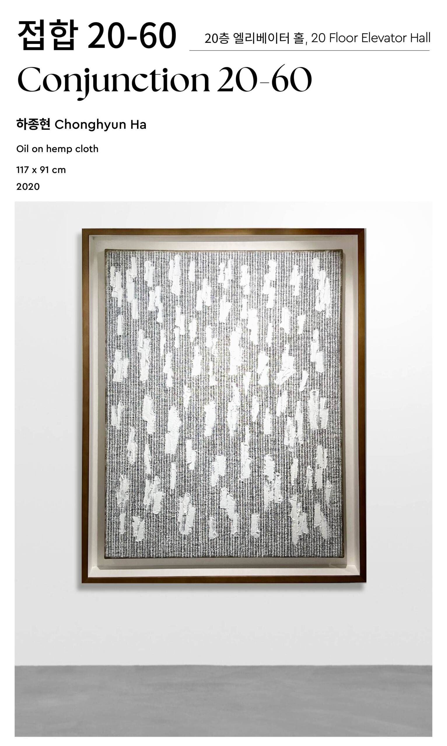
하종현은 ‘회화란 무엇인가’라는 질문을 바탕으로 50여 년에 걸쳐 유화를 다뤄왔다. 1962년부터 1968년까지 작가는 즉흥적인 추상예술 경향인 앵포르멜 스타일의 추상 유화 작업에 몰두했다. 이후 전위적 미술가 그룹인 한국아방가르드협회(AG)를 결성한 1969년부터 1970년대 중반까지 석고, 신문지, 각목, 로프, 나무상자 등 오브제를 중심으로 한 ‘물성 탐구의 기간’을 거쳤다. 이 시기에 작가는 한국전쟁 이후 미군 군량미를 담아 보내던 마대자루를 비롯해 밀가루, 신문, 용수철, 철조망 등 비(非)미술적이고 비(非)전통적 매체로 캔버스의 양면을 모두 활용하는 실험적인 작업방식을 시도했다. 그리고1974년부터 지금까지 마대자루를 활용한 경험에서 출발, 고유한 기법으로 자리매김한 ‘접합’ 연작을 완성해가는 중이다. 하종현은 올이 굵은 마포 뒷면에 두터운 물감을 바르고 천의 앞면으로 밀어 넣는 배압법(背押法)을 통해 독창적인 작업 방식을 구축했다. 앞면으로 배어 나온 걸쭉한 물감 알갱이들은 나이프나 붓, 나무 주걱과 같은 도구를 사용한 작가의 개입으로 다시 자유롭게 변주되고, 마침내 물질과 행위의 흔적이 결합된 결과물로 완성된다. 특히 캔버스 뒷면에서 앞면으로 물감을 밀어내는 방식의 파격적 방법론에는 작가가 추구해 온 기성 형식에 대한 저항적 태도가 담겨 있다. 그는 단색화 태동기부터 화면의 앞뒤를 구분하는 관행에 대한 비판적 관점을 제시해온 바 있다.
Ha Chong-Hyun is best known for his experimentation with paint and commitment to questioning the definition of painting. From 1962 to 1968, Ha devoted himself to making abstract oil paintings in the style of the improvisational abstract art movement known as Art Informel. From 1969, following the founding of the Korean Avant Garde Association (AG), through the mid-1970s, Ha went through a period of expansive “material exploration” centered on objects such as plaster, newspaper, wood, rope, and wooden boxes. During this time, Ha sought out non-artistic and non-traditional media such as flour, newspaper, steel springs, barbed wire, and began utilizing both sides of the canvas made of rough burlap sacks that once carried USAID rations following the Korean War. Exploiting the unique ground material, Ha established an innovative method where he applies thick oil paint to the back and pushes it to the front of the surface through the coarse weave, a process known as bae-ap-bub. This became the basis of his signature Conjunction series. The thick striated paint that oozes to the front is then freely transformed by the artist using tools such as knives, brushes, and wooden spatulas, which Ha appropriately modifies to create patterns that accentuate the pictorial plane. This specific process results in the piece becoming a “conjunction” between material and performance. Such an unconventional methodology illustrates Ha’s defiant attitude towards preexisting hierarchies and modes of painting.
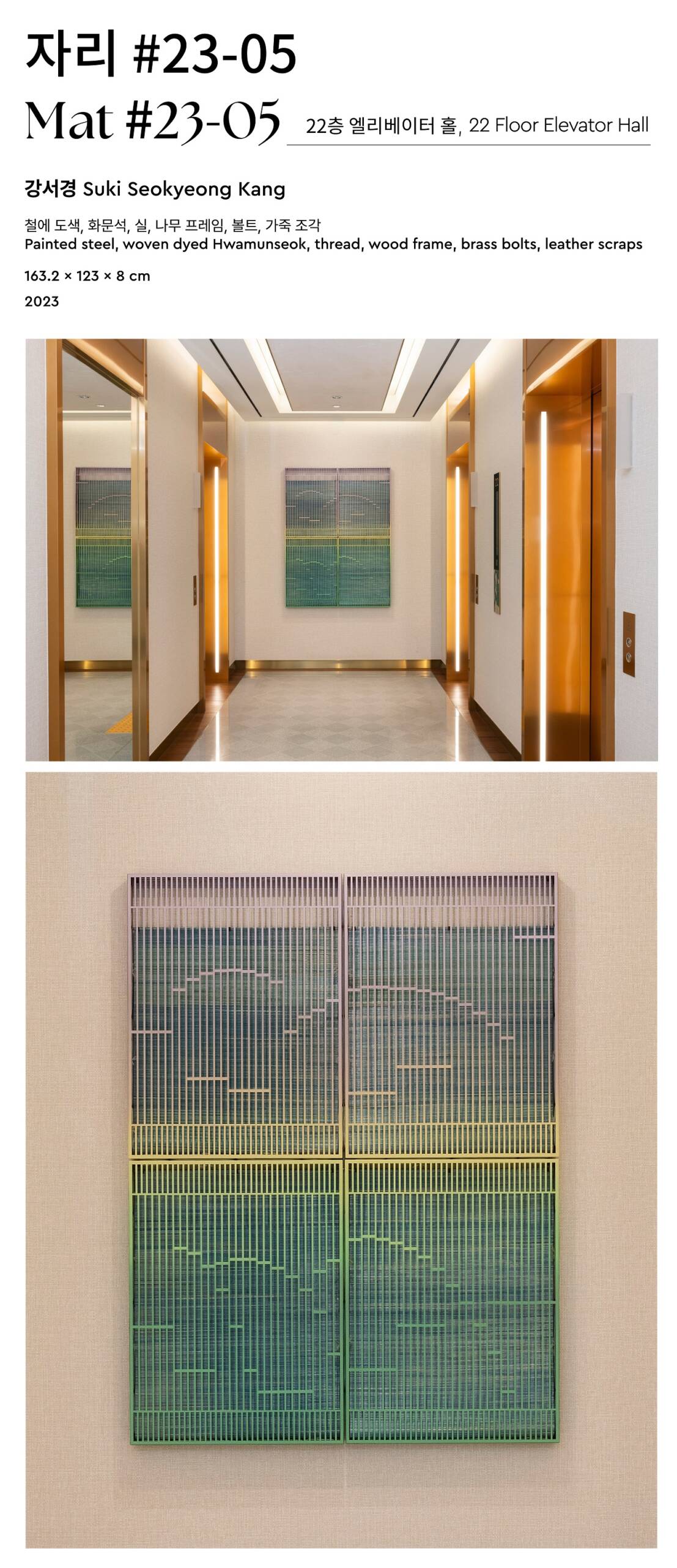
강서경은 한국의 여러 전통적 개념과 방법론을 참조해 자신만의 조형 논리로 직조해 내는 작업을 해왔다. 조선시대 궁중 무용 춘앵무와 유랑 악보 정간보를 재해석한 <자리 #23-05> 에서 강서경은 화문석을 사각 철제 프레임과 결합해 벽에 그림처럼 걸어 놓는 형태로 만들었다. 춘앵무는 궁중무용 중 극히 드문 1인무로, 절제되고 우아한 움직임 속에 서사와 시간을 담고 있다. 이 춤은 화문석이라는 자리 위에서 이루어지는데, 이는 무용수의 움직임이 이뤄지는 공간이자 그 움직임을 제한하는 물리적인 경계이다. 수공으로 한 땀 한 땀 제작된 화문석은 개개인의 운신을 위해 주어진 최소한의 공간을 이야기하며 다채로운 색상의 철제 격자 구조와 겹쳐져 두께와 공간감을 만들어낸다. 이 사각 프레임은 작가의 시선을 담아내는 회화의 단위 공간이자 소리와 시간이 담기는 정간보의 한 칸으로, 화문석과 사각 프레임이 조형적, 개념적으로 결합된 이 작품에는 각자의 자리에서 생의 시간을 살아가는 개개인의 보이지 않는 몸짓이 담겨 있다.
Suki Seokyeong Kang revisits various traditional Korean concepts and methodologies, weaving them together into a unique system of formal logic. In Mat #23-05, Kang reinterprets the court dance Chunaengmu and the musical score Jeongganbo from Joseon Dynasty to create a piece that combines Hwamunseok with a square metal frame that can be displayed on the wall like a painting. Chunaengmu is a rare solo dance among court dances, characterized by its restrained and graceful movements that convey narrative and time. This dance is performed on a mat called Hwamunseok which serves as both the stage that allows the dancer to move and a physical boundary that limits the movement. A visual metaphor for the minimum space allotted for each individual within society, the Hwamunseok mat with its handwoven warp and weft is overlaid by a metal grid structure to create a sense of volume and spatiality. This rectangular frame is at once a unit space of painting that withholds the artist’s vision and the square in Jeongganbo in which time and music is inscribed. Conceptually and formally combining the Hwamunseok and the rectangular frame, the work alludes to movements of each individual, occupying the time of life in one’s own position.